REMEMBERING A WAR MOST HAVE FORGOTTEN

If we remember it at all, we think of World War I as pointless; an obscene waste of life to achieve goals that were ill-defined then and inconsequential now.

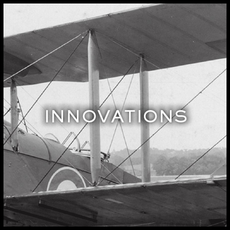
The National WWI Memorial and Museum wants visitors to understand the futility and waste, but also the constructive, even creative aspects of a war that shaped the world we live in today.

How do you express all that in a single logo?

National WWI Memorial Museum


Brand Identity


DECONSTRUCTING THE MARK


A simple animation that eloquently demonstrates the thinking behind the logo.


WORLDS COLLIDE


Just some of the iconic and historical graphic influences we simply couldn’t ignore in our journey for an identity fitting of this national treasure.


A TOUCH OF RED


Every museum visitor passes over Flanders Fields, a sea of poppies representing the war’s 9 million dead. Incorporated in our design, the color recalls the famous poem, pays homage to the fallen, and underlines the “I” in WWI”.